Fonts
Moody College uses the same primary typefaces as The University of Texas at Austin – BentonSans (san-serif) and GT Sectra (serif) for print plus Libre Franklin (san serif) and Charis SIL (serif) for web. These typefaces have been selected to maintain a consistent tone across university-wide print, web and environmental applications.
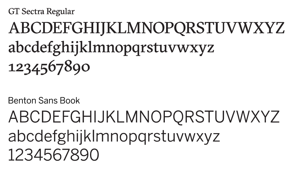
To capture Moody College’s brand personality, we introduced a secondary font, Saltery Rough to be used sparingly for emphasis as a complement to Benton Sans and to emphasize a short word or phrase you want to stand out in copy. It should not be used for phrases longer than three words. For permission to use Saltery Rough, please contact Kathleen Mabley.
Colors
Color is critical to the Moody College brand. Using color in a consistent way reinforces our brand and fosters trust and recognition. Moody College uses the same brand colors as The University of Texas at Austin, where burnt orange, charcoal and white remain at the forefront as the primary color palette. The distinctive burnt orange plays a major role in establishing our identity and should be implemented consistently in all print and digital applications as the dominant color.
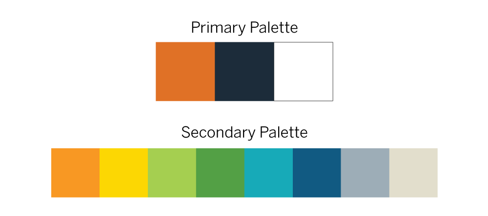
The secondary color palette, when combined with burnt orange and white, provides versatility and variety in order to set Moody College apart from other colleges, schools and units. Avoid using secondary colors more prominently than burnt orange to prevent creating an environment where our brand is unrecognizable
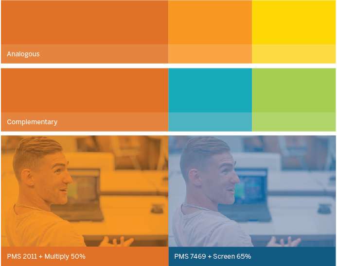
Combine burnt orange with secondary colors in order to create an energetic, fresh and inviting layout. Using color creatively will assist in capturing Moody College’s brand personality. Burnt orange can be combined with analogous colors such as the secondary orange and yellow or with complementary colors such as blues and greens. Apply these color combinations through the use of color overlays (e.g. apply “multiply” or “soft light” effects with an adjusted opacity) over images and on other graphic elements such as headlines and line treatments.